Experiencing iPhone OS for the first time
I’ve never really used an iPhone or iPod touch (they share the same OS, although only the former has the telephony part) before now. I picked up a second hand iPod touch yesterday to assist me with my iPlayer hacking, and it’s given me the first chance to experience the user interface in any depth.
My new-old iPod is a first generation device, but it has the latest firmware (3.1) on it. For comparison, I have an HTC Hero phone, running Android 1.5—we’re still waiting for HTC to get around to releasing their long-promised and repeatedly delayed OS upgrade. So round one goes to Apple: they are much better at releasing upgraded versions of the operating system for their handsets than HTC.
I thought it would be interesting to record my initial impressions of using the iPhone OS from a user interface point of view. It’s not quite as perfect as I’d been led to expect, but it’s pretty good. From a hardware standpoint, both the iPod and the Hero are competent enough that I feel justified in blaming any slowness on the software.
It’s hard to go back a screen on iPhone OS if you’re right-handed and holding the device in the natural way. The back link is in the top left, at the furthest point on the screen from your thumb. Is Steve Jobs left handed? Or Jonathan Ives, maybe?
Both the Hero and the iPod exhibit occasional user interface latency. The latency of the Hero is unpredictable; the iPod freezes during certain procedures, such as when attaching an image to an email.
The iPhone OS on-screen keyboard is much better than on the Hero. The difference is much bigger than I would have imagined possible, and goes to show that there’s a lot more to making an on-screen keyboard than just putting a keyboard on a screen. The larger screen and greater spacing between letters of the makes a difference, as does the responsiveness of the interface. There’s a perceptible delay in response on the Android keyboard, but the iPhone OS’s feels like it responds instantly. I’m also told that the keyboard dynamically resizes the target area for each key based on the probability of it being the next letter.
The graphical design of the iPhone OS user interface looks a bit tacky to me. It’s something to do with the corner radii and the tired and overused gloss effect on everything, I think. The home screen icons of the default apps that come with the OS are a mish-mash of colour and style, and some of them are just really lazy, poor design, such as the Mail, Weather, and Music icons. That Notes icon in particular is just awful.
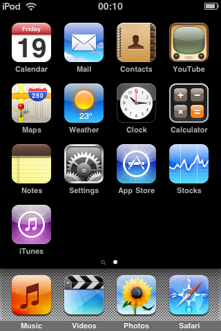
The mesh background at the bottom of the home screen looks like the dashboard of a boy racer’s souped-up Type-R. I’m not sure what it’s doing there. Not a good look.
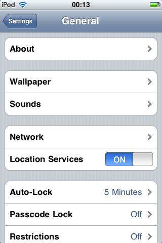
The black background of the home screen isn’t very appealing, but there’s no way to change it as far as I can tell.
It’s easy to take a screenshot on iPhone OS
once you’ve looked up the button combination (hold bottom button,
press top button, release bottom button). It’s almost impossible on
Android. I’ll therefore forgive the iPhone OS for storing (or
sending) the screenshots as JPEGs.
In summary: looks a bit tired; works well; keyboard is excellent.