Things to do with leaked postcode data
An interesting file turned up on Wikileaks yesterday:
UK government database of all 1,841,177 UK postcodes together with latitude and longitude, grid references, county, district, ward, NHS codes and regions, Ordnance Survey reference, and date of introduction. The database was last updated on July 8, 2009 and is over 100,000 pages in size.
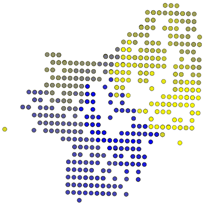
Something that I thought might be interesting is to see how postcodes are distributed within an area. I took all the postcodes from my local area (SE16), put them in alphanumerical order (1AA, 1AB, ..., 1ZZ, 2AA, ... etc.) and used JavaScript and the canvas element supported by newer browsers to visualise them.
They’re plotted on a (colour-blindness-friendly) colour continuum from blue to yellow, with a short delay between each. This results in something like this:
It’s interesting to see that postcodes are allocated roughly in a clockwise spiral out from the centre. The reason why they are all in a slightly skewed grid is, I think, a result of the latitude/longitude being translated from OS grid references.
You can watch the animation here if your browser supports it. Safari, Firefox, Opera should be fine. Internet Explorer need not apply.
