Where the bad guys are
I was inspired by the Mailinator Spam Map to do something similar with attempts to break into my server.
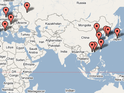
I’ve been using a tool called DenyHosts to monitor the logs and block any IP addresses from which someone attempts to mount a brute-force SSH attack—something that happens disturbingly often. Being a person who hates to see data pile up without being analysed, I thought that it would be interesting to see how these attackers are distributed geographically.
Using the block list (the hosts.deny file), the API
at hostip.info, and
the Google Maps API,
plus a little Ruby to tie it all together, I have done just that.
Here is the map.
It’s worth noting that the pins on the map don’t indicate malicious intent per se: these attacks tend to be mounted from already-compromised hosts. Thus, it’s more an indication of poor server administration than anything else. The results also support the widely-held view that China and South Korea have a particular problem with poorly-secured servers.